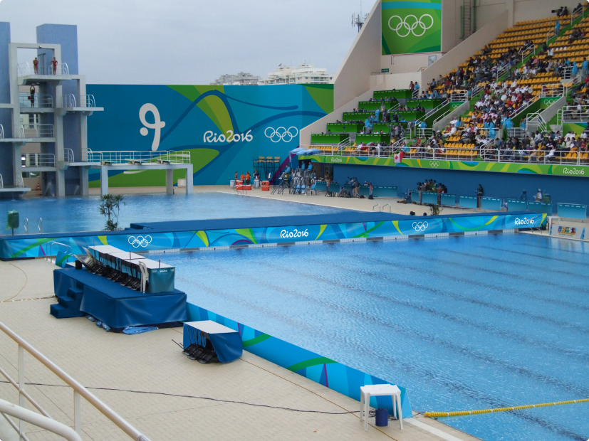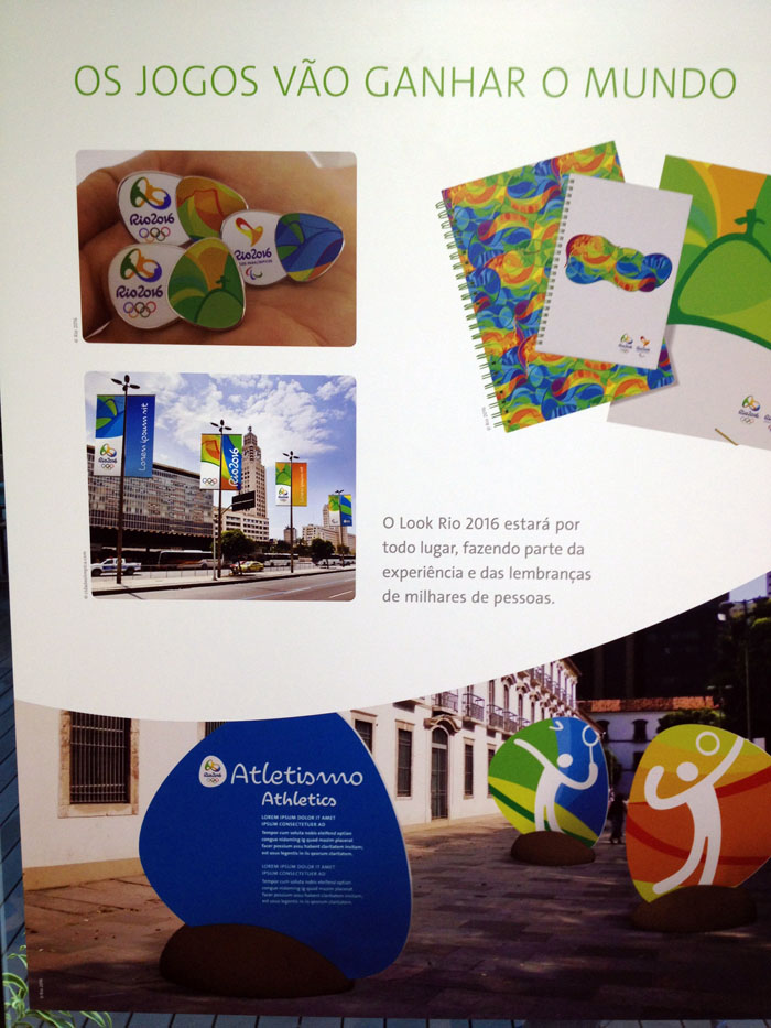

Read more:
- Rio 2016; Look of the Games (creative process)
- Rio 2016; Look of the Games unveiled
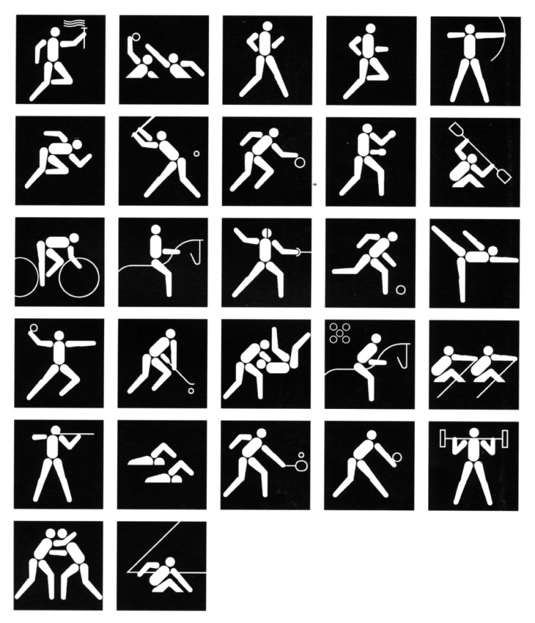
- Rio 2016; Sports pictograms creative process (2)
- Rio 2016; Sports pictograms creative process
- Rio 2016; pictograms
- Rio 2016; Font


Source: www.rio2016.com

Designed by Walter Herz
![]()


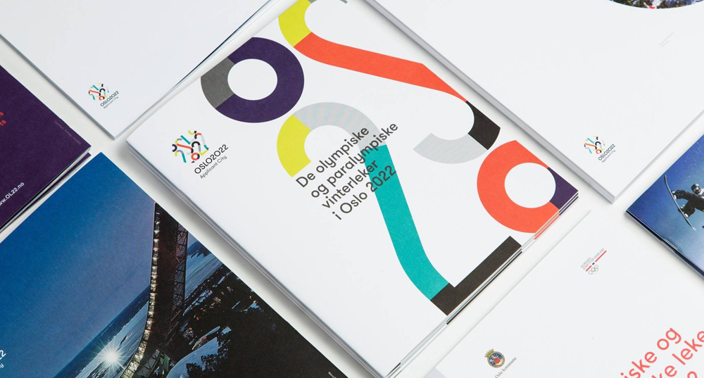
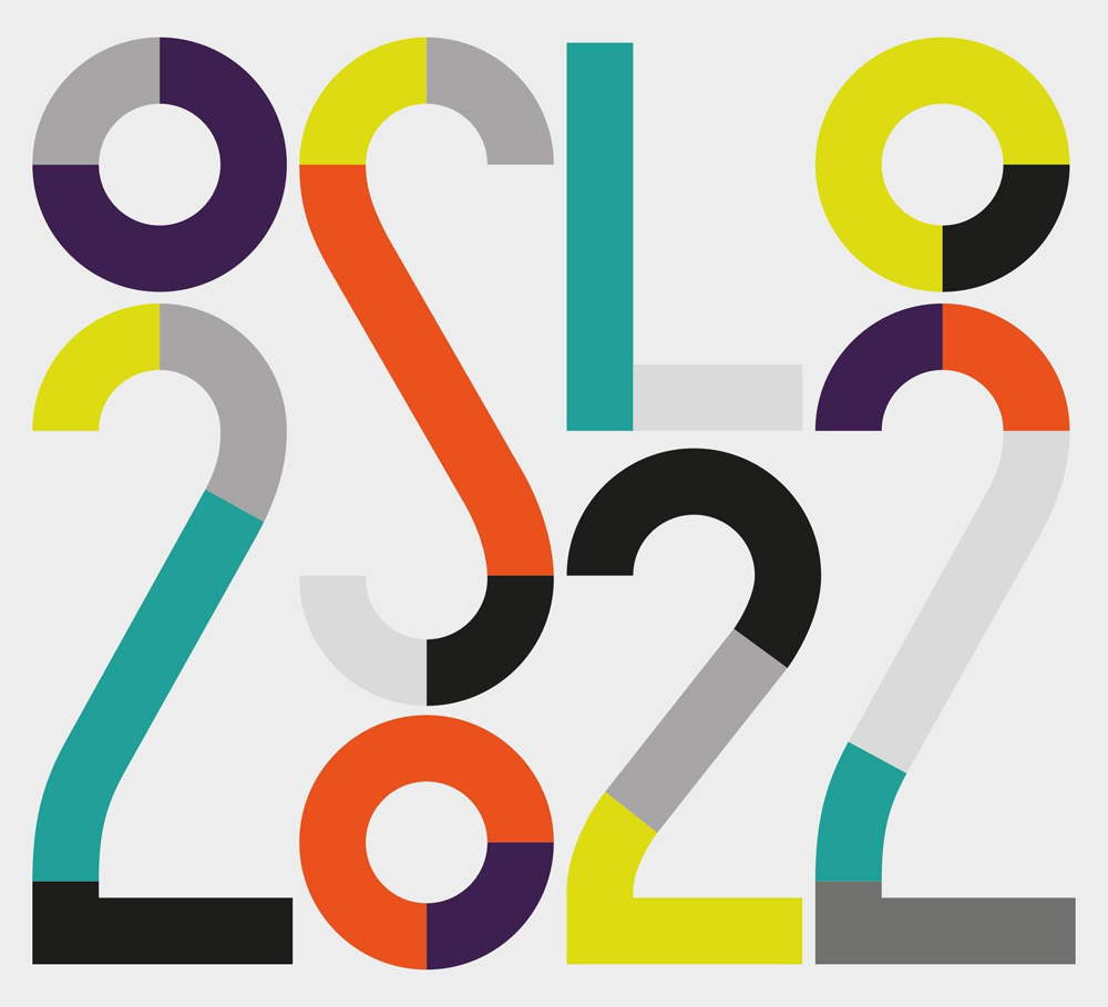
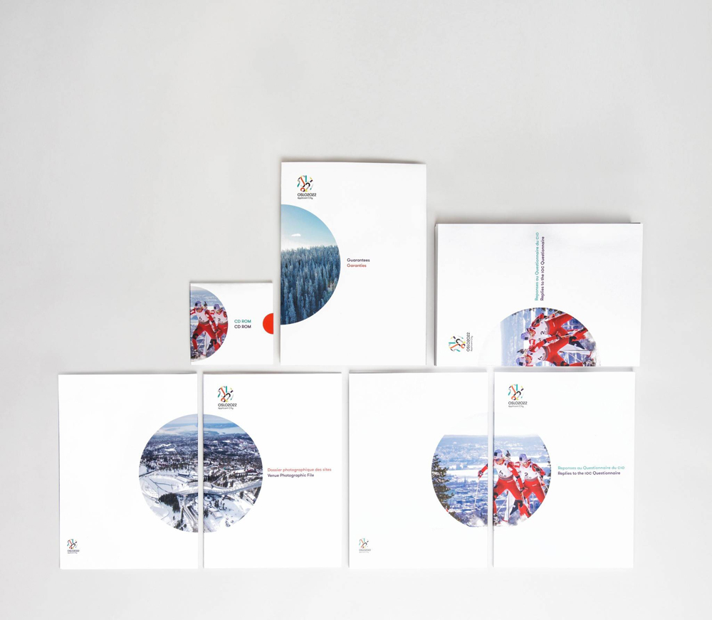
The world’s largest event for winter sports meets Nordic Simplicity.
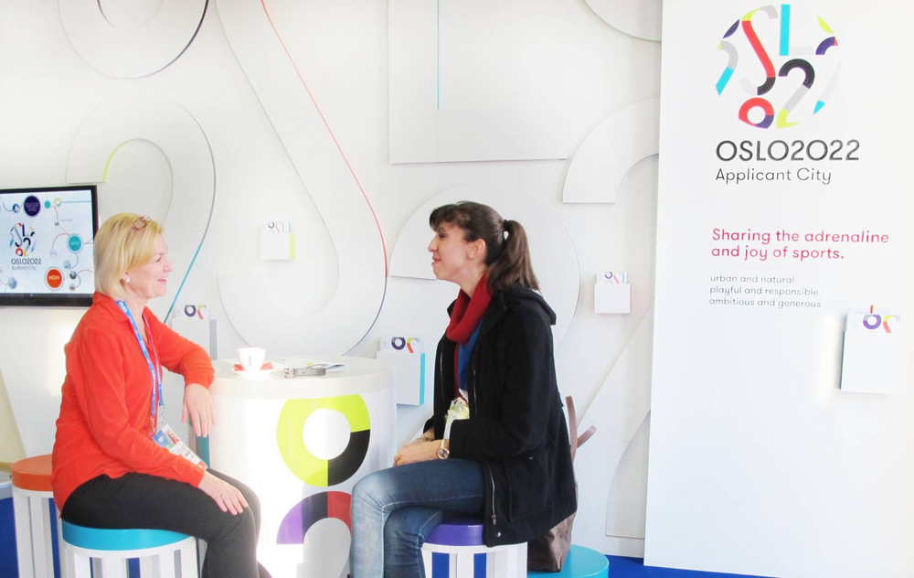
In 2014, Snøhetta was commissioned to design the visual identity and feasibility study for Oslo 2022’s Applicant City bid. The identity of Oslo 2022’s visual language honors the inherent simplicity and openness in Nordic culture. By balancing playful graphics and strict geometry, the identity represents both the celebration of the Games and the solid planning of the Norwegian bid. The ambition for Oslo’s 2022 Winter Olympics bid is to share the genuine passion for winter sports, and invite the world to an open, friendly and sustainable celebration of sports.
![]()


More info:

(Click to enlarge)


The design of the Rio 2016 font depicts the essence of the Olympic and Paralympic emblems: Passion and Transformation. The boldness of this creation is not only in the design, but also in its importance for the design market in Brazil. The Rio 2016 font is one of only a few bespoke fonts created by a Brazilian team.
Source / Read more: Rio2016.com

A video is produced covering the “Look of the Games” on behalf of the International Olympic Committee (IOC) for each Olympics. This video includes an overview of the work produced for the 2008 Summer Olympic Games in Beijing, China. It includes key insights from select individuals responsible for helping shape each city’s imaging program.
Iconologic founder and Look of the Games Advisor to the IOC, Brad Copeland, is featured in this video.