


Emblem

Pictograms

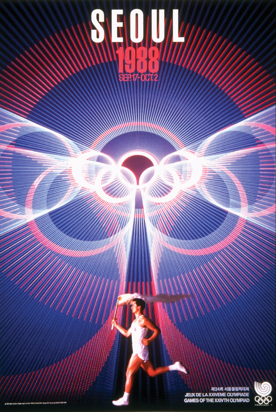
Poster
Mascot

Wayfinding

» Link (Olympic World Library)
» Link (Olympic World Library)
» Link (Olympic World Library)
» Link (Olympic World Library)
» Link (Olympic World Library)
» Link (Olympic World Library)
» Link (Olympic World Library)
» Link (Olympic World Library)
» Link (Olympic World Library)
» Link (Olympic World Library)
» Link (Olympic World Library)
» Link (Olympic World Library)
» Link (Olympic World Library)
» Link (Olympic World Library)
» Link (Olympic World Library)
» Link (Olympic World Library)
» Link (Olympic World Library)
» Link (Olympic World Library)
ONE TEAM PROJECT Asao Tokolo and Fuyuko Matsui 「Tokyo 2020 Emblems connect Tradition and Innovation」
*Please access English subtitles through the Closed Captioning (CC) button on the bottom right of the screen
The use of ‘Japan Blue’ pigment (Lapis Lazuli) is deeply intertwined with a number of traditional Japanese art forms, and you’ll find it appearing in various Tokyo 2020 designs and graphics. In this instalment of the One Team Project – an initiative where creators and innovators representing Japan share their visions of Tokyo 2020 with us – Tokyo 2020 emblem designer Asao Tokolo and world-renowned artist Fuyuko Matsui discuss the subtle beauty of Japan Blue, what it symbolises, and how they have integrated it into their creative work.
The new logos for the Beijing 2022 Olympic and Paralympic Winter Games were unveiled today:


Images: The Beijing Organising Committee for the 2022 Olympic and Paralympic Winter Games
Concept videos
Tommorow, the logo for the Beijing 2022 Olympic Winter Games will be unveiled. Below you will find (in anticipation for this event) the launch video and a promotional video of the emblem of the 2008 Beijing Olympic Games.
Video by Design Indaba on YouTube
Video description
Strategic consultancy firm Tátil Design created the Rio 2016 Olympic identity with the hearts of the people of Brazil in mind. Its founder Brazilian graphic designer Fred Gelli spent the last 25 years studying biomimicry, imitating nature’s solutions to solve human problems. Gelli and his team drew inspiration from nature’s solutions to define the design principles that inform their award-winning work.
For Design Indaba 2016, Gelli detailed the various design principles that inform the firm’s creations. From the simplicity of Coca-Cola’s Olympic identity to the firm’s own identity. “We wanted to create something without any kind of photoshop,” says Gelli as he reveals a stencil of the Tátil Design logo. Half transparent and half mirror, the stencil allows the user to create the background of the logo using their everyday surroundings.
Staying true to Tátil’s human-centred approach to design, Gelli created a multisensory experience for the 2016 Olympic identity. The 3D design reflects local culture in a way that is universally understood while it also stays true to the local landscape. “The target audience was the entire world,” said Gelli.
“It will be seen on a mobile screen in Manhattan and on a piece of paper in a remote town in Brazil. It was a huge challenge. You try to use the values that underpin the Olympics, like union and togetherness, something bigger than sport, to create something that will inspire people.”
